Understanding New York's Traffic Violence with Machine Learning
tl;dr
I built a custom dataset and trained a machine learning model to understand how transportation planners could reduce traffic deaths in New York City. I found neighborhoods with a higher percentage of people who commute by public transit contributed to the model predicting a crash as non-fatal and crashes within zones designated as a priority by policy makers had a similar effect.
Background
Machine learning models are becoming increasingly popular for use in traffic modeling, where traditionally statistical models were used. In 2014, New York City implemented the Vision Zero program, aiming to eliminate all traffic deaths and serious injuries by 2024. The city is nowhere near meeting that goal and the data is trending in the wrong direction. Traffic violence has killed 223 people in 2023, a 25% increase over 2018 which was the safest year under Vision Zero. This year is also set to be the deadliest year for cyclists since 1999. At the same time, New York City was recently granted powers by the state government to expand the use of ticket-issuing speed cameras, which have been shown to reduce dangerous driving in their vicinity.
With this in mind, and having also looked into reduced traffic enforcement by the police, I was curious to see if I could find other methods for keeping pedestrians and cyclists safe.
Data and Methods
In order to understand what New York City could do to increase safety, I built a custom dataset using NYPD motor vehicle collision reports as the base. I then added features such as distance from a speed/red light camera, if the crash was near a traffic calming project or if the crash occurred within zones targeted by city officials for safety improvements. I also included demographic features to see if commuting patterns and income levels could be contributing factors, as well as the number of complaints to the city’s municipal hotline, NYC311, about street safety issues. Since the city doesn’t publish the location of speed cameras, I had to reverse engineer this information from parking ticket records. Camera-issued fines have basic intersection information, which I then cleaned, geocoded to add latitude and longitude and calculated crash-camera distances. A key to determining if a crash was near a camera was to compare the dates the camera was operational-based on a date range when it issued tickets-and the crash date. Cameras were considered “near” a crash if they were within 200 meters, a distance selected based on previous studies. Here’s the full list of sources used to create the dataset:
- NYPD Motor Vehicle Collisions
- US Census Bureau
- NYC Department of Transportation Vision Zero
- NYC Department of Transportation Turn Calming
- NYC 311 Complaints
- NOAA Global Historical Climatology Network
- NYC Parking Violations Database
A major challenge is the imbalanced nature of the dataset, where (thankfully) only about 1 percent of crashes were fatal. This was overcome with a combination of under sampling the majority class and over sampling the minority with SMOTE to create a 2:1 ratio in the training data. Further experimentation showed improved performance outside this framework, such as a Logistic Regression model using only random undersampling. I also experimented with using SMOTEBoost, which combines the SMOTE algorithm and boosting classifiers. While there are many other ways to overcome imbalances in data, these were selected for achieving improved results given the available compute. I ultimately compared ten different classifiers using these two training pipelines (I removed random_state parameter for readability):
from imblearn.over_sampling import SMOTE
from imblearn.under_sampling import RandomUnderSampler
from imblearn.pipeline import Pipeline

sampler = {"over_first":
             [('over', SMOTE(sampling_strategy=.1)),
              ('under', RandomUnderSampler(sampling_strategy=.5)),
              ('model', classifier)],
           "under_first":
             [('under', RandomUnderSampler(sampling_strategy=.1)),
              ('over', SMOTE(sampling_strategy=.5)),
              ('model', classifier)]}
Results
After trying a range of models and sampling techniques, I selected a CatBoost classifier based on it achieving the highest average precision score of 0.088. While this seems low, it must be compared against a dummy classifier which for this dataset would have a score of 0.010 (representing the 1 percent of the positive class or Killed). This represents a 750% improvement over a random guesser. A Logistic Regression model was also trained since it achieved the highest recall, but those results are not the focus her and for real-world deployment the CatBoost model would be more appropriate.
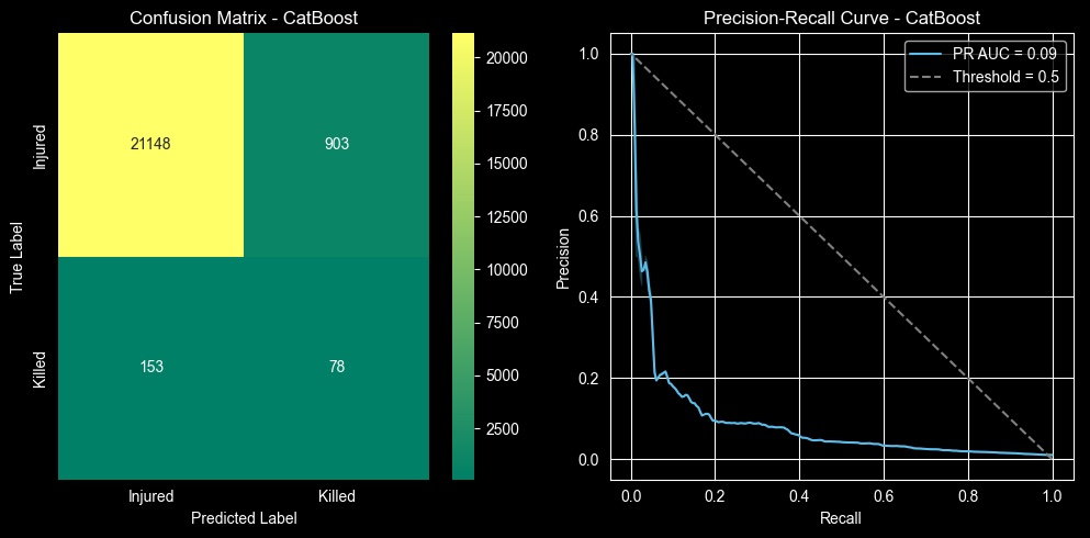
| Precision | Recall | F1 Score | Support | |
|---|---|---|---|---|
| Injured | 0.99 | 0.96 | 0.98 | 22051 |
| Killed | 0.08 | 0.34 | 0.13 | 231 |
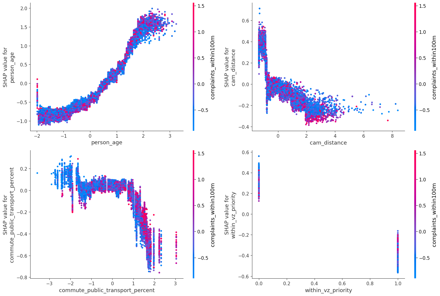
Interpreting the CatBoost model using SHAP values showed the single most important feature for predicting a fatal crash was the age of the victim. That older people tend to die when hit by a vehicle in unsurprising but still relevant for decreasing collision fatalities. Transportation planners could focus on locations where older people were hit to learn more about how to prevent deaths in the future or target older New Yorkers in education campaigns.
The model also revealed the potential impact of commuting habits on collision outcomes. If a crash happened in a ZIP code where a higher percentage of people who commute by public transport, it pushed the prediction of the model toward classifying the crash as non-fatal. Once that proportion hit 30 percent, the effect became more pronounced. Moreover, these ZIP codes also tended to have more complaints about traffic safety within the vicinity of a crash. This could suggest more citizen complaints would invite greater traffic enforcement, although more detailed research would be necessary to establish this.
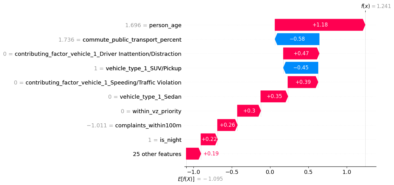
As part of the Vision Zero program the NYC Department of Transportation has created several zones marked as “priority” under the program. If a crash was outside these zones, it contributed to the model predicting a fatal crash, while collisions inside these zones had the opposite effect. And while speed/red light cameras have decreased dangerous driving according to city studies, proximity to a cameras was associated with increasing the likelihood of a fatal prediction. But being within 200 meters of a camera generally contributed to the model predicting a non-fatal crash. This could be a sign transportation planners need to focus on other measures near cameras to improve safety in other respects.
Next Steps, Improvements, Recommendations
Perfect is the enemy of good, and at a certain point I had to stop tinkering with this model. I would like to do more work to improve the model’s performance, and investigate what features, tuning or sampling techniques could work. In a real-world scenario this would depend on stakeholder input and needs. Ultimately the results provide actionable guidance to policymakers for educational campaigns, traffic engineering, and infrastructure improvements aimed at reducing traffic deaths. Based on the current model, here are some recommendations and insights:
- NYC Department of Transportation (DOT) should apply the same measures used in Vision Zero priority zones to all areas of the city.
- DOT should also investigate additional safety measures near traffic cameras such as traffic calming or daylighting.
- New York’s Metropolitan Transit Authority should build out high-quality public transportation citywide to aid in reducing traffic deaths.
- As part of the exploratory data analysis I found the top reason given in fatal crashes as a contributing factor was Pedestrian/Bicyclist Error, representing a third of cases. The crash data is compiled by NYPD at the scene of a crash, and when someone has died this implies a strong deference to the driver (think of the common refrain: “They came out of nowhere”). Therefore I would recommend a closer examination of training for officers responding to motor vehicle crashes.
- In a future version I would want to change this to a multiclassificaiton problem with the minimum categories being: property damage only, injured, severely injured, and killed. New York’s DOT has a program for reporting more granular injury statistics, but it only began reporting in 2022.